Know the Viewport and the Importance of Zoom for Blog Views
I made this article because it turns out that there are some who make tutorials so that the blog can't be enlarged or zooming in mobile view. But what I say will be inversely related to the tutorial. Is disabling zoom really necessary? The reason? Listen on until it's finished.

Appearance and accessibility are important factors that make visitors feel at home to linger on our blog. The combination of colors that are easy on the eyes, the existence of a navigation menu and widgets that makes it easier to explore other content, this kind of thing should be carefully chosen so that visitors feel comfortable.
Included in the selection of the font type and size. Be smart in choosing fonts that are simple but still look elegant. Sometimes this makes a headache because there are so many types of fonts in circulation. Fortunately, now there is a free service from Google Fonts which contains a collection of cool fonts and can be used freely. Just choose which one to use. The tutorial itself is in an article entitled How to Use Google Fonts on a Blog .
Font type is done. Then what about the size? Although there is no official standard, usually the font size is not far between 12px, 14px, and 16px. Is that sure? Not. This is just the size that most people wear.
Each visitor has their own standard of comfort. There are those who like small font sizes, there are also those who prefer to use large font sizes. This difference makes us as blog managers must be smart to outsmart it. Especially when accessed on a cellphone that has a smaller screen. One simple but effective way is to enable the ability to zoom / enlarge (view) when the phone screen di- pinch (pinched).
Why is Zoom Important?
Because it affects the user experience or user experience. If zoom is NOT enabled, this is problematic for low-vision visitors (eg minus eyes) who rely on browser zoom to view web page content .
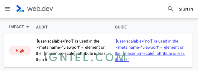
I did the test by purposely disabling zoom and tested it on the website.dev . The results were predictable: blogs got a warning with an impact score Highon the category Accessibility, meaning this has a big impact on accessibility.


How To Fix It?
It's very, very easy. The browser's zoom capability is governed by the parameters user-scalablein the tag <meta name="viewport">. Take a look at the respective code templates which are more or less like this.
<meta content='width=device-width, initial-scale=1' user-scalable='no' name='viewport'/>noor 0become 1.<meta content='width=device-width, initial-scale=1' user-scalable='1' name='viewport'/>Or you can delete it as well, it can turn out like this.
<meta content='width=device-width, initial-scale=1' name='viewport'/>After I fixed it, the error message on web.dev went away and immediately got the green light.
Bonus
This is the complete viewport code that is used on the Igniel blog and in all the templates I make, both free and premium. If you want to use this, please, or use the code above which is shorter.
<meta content='width=device-width, initial-scale=1.0, user-scalable=1.0, minimum-scale=1.0, maximum-scale=5.0' name='viewport'/>Currently, almost all templates have the correct viewport settings, so chances are you don't need to change anything. However, this article must be made just in case there is something wrong with the viewport.
Is It Mandatory?
NOT. Big sites like Twitter and Facebook can't even be enlarged on the mobile version (at least until this article was written). Just try opening the site on a mobile browser. So everything comes back to you as a blog administrator. Want to use the zoom or not?